How to Choose a Color Palette for Your Home (Without Hiring a Designer)
A simple system that turns "is this cute?" into a room that actually feels like you.
It genuinely burns my biscuits that there’s such a massive gap between hiring a full-service designer, and going rogue DIY. Sure, there are e-design courses out there — I’ve looked at a few, and mostly I found a bunch of industry jargon with very little translation to my actual home. As a Holistic Home Stylist, it’s my personal mission to carve out a whole new path for DIY-ers who aren’t hiring a designer, but who do want their inner world translated in their outer space.
It’s my humble opinion that everyone on earth deserves beauty, and I don’t believe you have to pay someone to tell you what’s correct or to “install” it for you.
Here’s the thing though, I am not knocking the interior design industry on the whole. I just think for most average people, it’s inaccessible, overpriced, out of touch and frankly unnecessary! Most people don’t need a perfect, showroom-style living room. They need somewhere that feels like their inner world has been accurately translated to their outer space.
They want to walk into their house and feel calm and settled, like they’ve entered a sanctuary built just for them. They want to feel expressive, alive and seen inside their own house.
Hiring a designer is a great move if you want or need the service, but for everyone else, what are we left with? The burden of figuring out an entire design process all by ourselves, armed with a Pinterest account and a ScAmazon account.
IT’S A LOT! From choosing a color palette for the room to making investments in furniture and all the way down to selecting art that “feels authentic,” there are genuinely too many decisions for one person to make succinctly without losing it!
I say that from personal experience and the experience of the clients that think they have no style, but what they really have is no structure.
DIY Doesn’t Have to be Painful
This past week, I held a free Instagram Live Mood Boarding Workshop, where I walked students through making a mood board that actually helps solve this problem — I wrote about it last week, too. You can read that here. (And I recommend starting with a mood board if you have no freakin’ idea where to start!)
My goal here is to validate the fact that styling or designing your space is actually hard as much as it is fun, but with a system to follow, the hardest part moves from drowning in overwhelming decisions to pacing yourself through the process because the puzzle has finally clicked into place.
The secret to making styling easy and fun isn’t the “right” mood board or inspo photos, it’s knowing how and when to make decisions that make you feel good. The sanctuary you want is on the other side of answering questions like, “What colors feel safe to you?” “What textures make you feel calm and soothed?” “What kind of lighting feels most relaxing to you?”
All the inspo in the world is functionally useless if you’re not connected to any of it, so that’s I follow a repeatable structure called the Foundry Formula every time that eliminates unnecessary decisions and teaches you how to answer the questions that matter!
How to Say, “Yes” to Color in Your Home
In previous posts, I’ve talked about the very first step I follow with every client and in my own home, which is Clearing Space (you can find that post here). Today though, instead of saying “No,” we’re going to learn how to start saying, “Yes.” Yeehaw.
Everyone wants a home that “feels authentic,” but a lot of people actually have no idea what’s “authentic” to them because they’ve never really thought about it beyond a surface level, “Is this cute?”
And lemme tell ya, a lot of things are cute. But once you bring them home, they just become more clutter. I’ve been there a time or 200 myself.
To help myself and clients learn how to say yes without second-guessing, we build in some parameters by outlining a color palette.
Choosing a color palette is the second step of seven in the Foundry Formula because it gives us some guard rails to follow. Outlining 3-5 colors we want in our space automatically eliminates all the “cute” things that no longer practically make sense. Choosing color early in your design process sets up an auto-filter system for your brain, so every decision you make going forward has a standard to meet.
Let’s talk about how to do that.
Color, Coordinated
First, ask yourself if you’re drawn to simplicity or a little more “busy-ness.” If you’re just starting out or like a simpler-feeling room, start with 3 colors. If you want to spice things up a bit more, go with 5.
The next question you need to ask yourself is: “How do I want this room to feel when I’m using it?”
Go deep. Picture yourself in the room. What are you doing? Who’s there? What are you wearing? What time is it? Really transport yourself to the moment and visualize what’s around. What colors come to mind when you imagine yourself using this space? These are your clues — start writing them down or saving photos/swatches.
Next, think about atmosphere— as in, which of the colors in your mind do you want to make the first impression? For example, is this room soft cream at first glance? Jungle green? Lilac? Burgundy? The dominant color in your mind has just become your primary color. Congratulations! You did it.
You can follow a quite simple rule of thumb from here if you need it: The 60/30/10 rule. Let your primary color cover about 60% of the room, let your secondary color cover about 30% of the room, and let your accents take up the remaining 10%. And listen, this isn’t a science — it’s a helpful tool if you need it.
Simply by prioritizing your colors, you’ve created a coherent hierarchy that looks like you planned it intentionally without eliminating your personal style. And here’s another sneaky trick that once you see, you can’t unsee it: To make any color look intentional in a room, repeat it 3 or more times. That’s it! You’ve gone from random color pops to intentional infusions.
You’ve taken swirling ideas and slotted them into their place.
Look at this example:
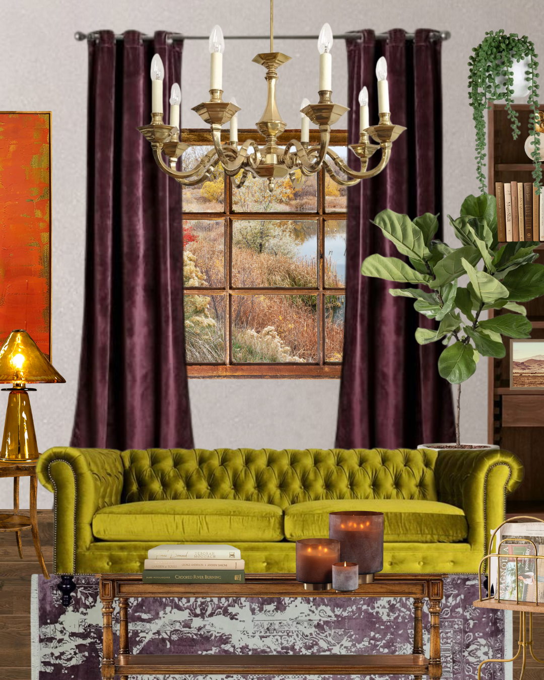
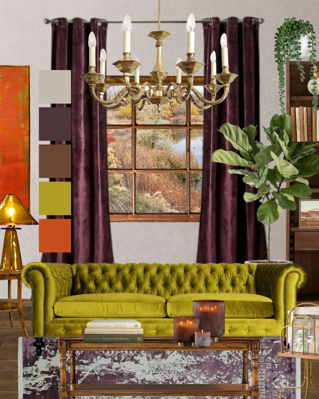
The most dominant color in this mock up is a grey-ish color. Then we have a deep plum, lots of wood, an orange/amber combo in the art and candles, and the one I want to point out: chartreuse. Of course, in this room there could be more of this amazing color hiding out, but we can’t see it from this POV. HOWEVER, we can see green accents in plants, books and a little greenish-gold in the orange art. All this adds up to “green” in my book because it’s repeated.
I don’t want you to be afraid of bold expression — I want you to see how just about any color your drawn to can be woven into a room that looks styled instead of chaotic.
Notice all the places color is showing up: It’s not just the paint on the walls. It’s in the details, the natural elements, the fixtures and accents. Each piece works together under a set of pre-established parameters, so you’re asking less, “Does this go?” and asking more, “What color do I want to see more of and what would be fun to add next?”
TLDR:
Start with 3-5 colors
Ask how you want to feel + what colors invite that feeling
Pick a dominant color to lead the way
Fill in the rest as you go, turning each color up or down to your preference
After you've chosen a color palette, you're off to the races, baby. You didn't need a designer — not that you were going to hire one. You needed structure. Home styling doesn't require magic, luck, or crazy talent. It requires a process — unsexy as that sounds.
I want to make DIY home styling easier and more accessible — because like I said up top, everyone deserves beauty in their life. I believe in access, not gatekeeping, so I'll be honest: one blog post won't solve every style conundrum coming up for you.
Let’s stay in touch: jump into my weekly newsletter, The Alchemy Archive, so you never miss one of these posts, and I’ll send you a Weekend Style Reset Guide that walks you through all 7 steps of the Foundry Formula.
Building a whole new relationship with your style and home doesn’t happen overnight, so take one or two things from this post and apply them, then come back for the next step.
Happy coloring, and I’ll talk to you soon!